Wednesday, 21 April 2010

Evaluation


How did you use media technologies in the construction and research, planning and evaluation stages.

In the planning of the digi packs i used digi pack cases and covers to deconstruct. i used my computer at home and scanner to get them on to the computer to them write about.


For this i used an apple mac computer and a HP DeskJet ALL-IN-1 F4280.
I used the word software to type up my deconstruction and then used Blogger.com

Through out my research into digi- packs i used the scanner to scan in my mind map.
I used it to scan in my sketches for the logo. I then used paint and publisher software to create my digi pack.

In the planning of my advert i used the same software as my digi pack. I used the same computer too. Also in the creating of my advert and digi-pack.

In the planning of my video i used YouTube and the internet to find videos to analyse.


after using the internet i used my apple mac computer to then type up my analysis on word software.

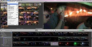
After the initial planning i used the scanner to scan in my animatic story board. I then used iMovie to create a short film with music.


Using iMovie was very easy and quick.
I cut and extended sections of the animatic, making the still sty on for longer when needed to fit with the sound track.

During the construction of the music video we created an animatic where i did this process again.
After this we used filming equipment to create our music video. We used cameras and tripods film.
We used: Canon MD 205 camera
Canon MD 235 camera


In the video we used an ipod:


We also used a Mobile Phone:


Through out the filming process we were using a camera to take still images of the filming process. We used a Sony Cybershot 12 megapixel camera.


We used iMovie again to upload the filming on to and then we cut and extended clips ect. like with the animatic.

We finally used iDVD to put the video on to disc.


All through out the construction and planning i used a variety of technology to get the best records of my planning and to create the best products to my ability. i found it very easy to use each thing during this.

Evaluation


What have you learnt from your audience responce feedback.

Catherine and Harriet made 3 people in our target audience watch our video. they were then filmed and asked questions which they answered. all about our video and what they thought of it.
This is the video audience response:


I gave the digi-pack and the advert to 3 people in my target audience. I did this to get some feedback on our final ancillary text. I let them look at the advert and the digi-pack whilst I asked them questions about them all. I then recorded their answers. From this I created some results.


Digi-Pack


What do you like most about the pack?
P1: the colour scheme and band logo on the front.
P2: the band logo and the constant use of shoes.
P3: Use of shoes and colours work well together.

What do you dislike most about the pack?
P1: The fact that not all the colours as consistent in the backgrounds on each panel.
P2: Not enough bold colours so less eye catching on the shelf.
P3: Plain and boring font.

Would you buy it if you saw it on the shelf?
P1: Yes
P2: Yes
P3: No

Why?
P1: It’s a cool design.
P2: I like the simple cover with the bright colours that catch my eye.
P3: I don’t buy CD’s I download it. Not for the cover either for the actual music.

What would you do differently to this pack?
P1: nothing, it would make it too complicated and cluttered.
P2: Change the backgrounds so they are all the same creating a uniform effect.
P3: Add some information about the band and its members on to a panel.

Is it easy to understand?
P1: Yes
P2: Yes
P3: Yes. Easy to read font.

Do the images work well together?
P1: Yes they are all relevant to the title of the album.
P2: Yes they are all shoes.
P3: Yes

Advert


What do you like most about the ad?
P1: The easy to read font and the use of the band logo.
P2: the background and use of the uniform colours.
P3: The font used is quite good. I like the lines with the shoe background.

What do you dislike most about the ad?
P1: The overall colour theme. The random purple is odd.
P2: I don’t like the way the words in the centre box have slip because they don’t fit properly. This looks very unprofessional.
P3: The purple bit at the top... What’s that about?

Would you pay attention to this ad and buy the digi-Pack?
P1: Yes
P2: No
P3: No

Why?
P1: I love the song I would recognise the band logo ECT. I would buy the album from seeing this advert in a magazine like Kerrang.
P2: I don’t pay attention to adverts in a magazine. But it would make me stop n have a look at it.
P3: I don’t buy music magazines. I watch music channels.

How would you change this advert to make it more appealing?
P1: I would change the font to make it a little more consistent, also to make it more eye catching to help promote the bands album being on sale soon.
P2: I would change the purple bit at the top defiantly.
P3: I would change the layout to make it more unique and more to the style of the band.

Is it easy to understand?
(All): Yes, nice and simple.

Does the advert link with the digi-pack?
(All): Yes.


Why?
P1: The colour scheme is similar to the digi- pack.
P2: The colour schemes are alike and so are the fonts of the album title.
P3: The backgrounds are similar in colour and the use of the logo in both the ad and the digi- pack.


From these result i have learnt that our digi pack has good elements and a few elements that could be imporved.

Digi- Pack
The good points:
Logo.
Shoes used in logo.
Colours and Schemes.
Simple
Would be bought if seen on shelf.
Easy to understand
All images work well together.

Not so good points:
Boring font
In consistent background colour
Lack of bold colouring.
Lacking in some information.


Advert
The good points:
The background in general
Easy to understand.
Good use of background colours.
Links with the digi-pack.

Not so good points:
Purple banner at the top isn't liked.
The information is cramped and broken up between words.
Not many people will pay attention to ad. due to downloads and internet.
More unique layout.
Inconsistent font.

Evaluation

How effective is the combination of your main product and ancillart texts?

the music video links well witht he digi pack as the digi pack is for the video's song.
But also the digi pack cover is featured in the actual music video.


The ipod used in the video displays the digi pack cover.

The digi pack and the advert link in colour scheme and vital information. The same logo is used in the cover and the advert, linking them visually.


The colour schemes are similar linking them. This similarity is very good for the audience as they can almost instantly associate the digi pack with the advert as they are almost uniform.

They dont seem to differ this allows it to appeal to target audience. Allowing the text products to be linked allows the audience to almost instantly associate the advert with the digi-pack.


Evaluation

In What Wayss Does my media product use, develop or challenge forms and conventions of real media products.

Reasearching my music videos i created a list of things that where typical features in this genre.
here are my generic features.

Generic Features...

Here are some key generic features that I have found into my research into existing music video of Alternate Rock Genre.

Researching into the two videos has shown me very important and common elements to a video of this genre, from camera shots to mise, en, scene. Comparing my two videos I noticed that…

· Many close ups on the lead singer/ band members.

· Often a few close ups on the band members playing an instrument/ showing their contribution.

· Extreme close ups on instruments, especially at vital times when that instrument is dominant in the song.

· Many long shots to show the band together and playing as one. Establishing the band.

· The band wears similar outfits. In terms of style and overall concept.

· The settings are usually on a stage or outdoors. But for the concept it tends to be narrative to the song lyrics.

· The lighting is always to highlight instruments if played in the video; also the lighting is often used in the performance parts, as they would look to a crowd at a concert.

· Props used are commonly instruments that are used in the soundtrack, along with a mic for the lead singer; this is the most commonly used prop. Speakers of some sort are often used too.


Close ups on the lead singer where all through out our video. this is a generic feature i found from deconstructing music videos of the same genre.

OUR MUSIC VIDEO:


YOU ME AT SIX:


MGMT:


Another feature is that that there are close ups on the band members and their instruments, so we did this in our video. as you can see above.

OUR MUSIC VIDEO:


YOU ME AT SIX:


MGMT:


We have establishing shots of all the band together too. As this is a generic feature I found in my research too.

OUR MUSIC VIDEO:


YOU ME AT SIX:


MGMT:


The band members are wearing all similar clothes which shows their relationship and style. this is our use of the generic feature i found with bands clothing in videos of this genre.

OUR MUSIC VIDEO:


YOU ME AT SIX:


MGMT:


The setting is the same as i found in my video research. the performance is on a stage setting and some of its outdoors. we did this in our video.

OUR MUSIC VIDEO:


YOU ME AT SIX:


MGMT:


The lighting used is highlighting the instruments. also the lighting helps replicate the lighting seen when at a concert watching the band. This is following a generic feature I found earlier in my research.

OUR MUSIC VIDEO:


NARRATIVE in our video ^^^


PERFORMANCE in our video ^^^^^
YOU ME AT SIX:
Performance...


MGMT:
Narrative...


This means our video is a hybrid according to Goodwins theory to music videos. in my generic features I found that most videos of this genre are hybrids, so we followed this feature.


In the research in to digi-packs i deconstructed 2 and found some generic features, these generic features are shown in our final digi- Pack.


  • Its eye-catching with large writing.
  • Consistent colour theme.
  • Has barcode and company info on the back.
  • Band name and title prominent.
  • Band Logo through out.
  • Simple layout and font.
  • Some parts are quirky and unique connoting bands style.
  • Simple bright cartoon image
  • Photos of the band members.

All these follow the generic features I found.


I researched adverts too. i deconstructed 2 digi pack adverts. This is the advert made using these generic features:


Eyecatching
Consistent colour scheme
Information small near the bottom
Title and band name larger than company info
Font clear and simple, easy to read.
important information more eye-catching as the least important info.
Bright colours.
layered imagery.
release date
band website
purchasing details.

Most elements of this advert follows the generic features i found from my earlier research.


Friday, 9 April 2010

Final Music Video.

This is our completed music video.

Music Video LogBook

We made a shooting list for the music video and selected locations as a group.

We then split the filming into sections and days.

The first part of the filming, I booked the cameras and tripods for that day.

I also helped set up the cameras during the first part of filming. Catherine and I worked together to pick the best angels for the shots ECT.

We didn’t have very many problems during the first part of filming. It did take longer than we had anticipated as the actor in the music video often struggled to get it all correct on first take.

Catherine and I helped by Makin it easier for him to do each time creating a smooth day of filming.

Each day we filmed we had a friend there to take photos of us filming.

Also on the first day it took so long it went dark and so some of the filming had to be postponed till the next day.

After the first part of filming Harriet, Catherine and I uploaded the filmed part onto the Apple Macs.

We filmed the second part, which was the performance, in a friend’s basement.

I drove the equipment and my other group members to the house in a near by village.

This part of filming went very smoothly, nothing went wrong.

We set up 2 cameras and filmed the whole song three times through to allow us to get the best variation of shots.
We even filmed the band from behind.

We then uploaded the new part of the video on to the Macs.

As a group we began to put the first part of the video together by cutting and speeding up certain parts to match with the music we uploaded days before.

It took some time to get used to using the iMovie software. I didn’t find it as hard to use as I have an Apple Mac at home and have used the new version of iMovie before.

We then booked the cameras for the final time and made sure Harriet and her boyfriend were available to film for that day.

Harriet and I drove over to the location with the equipment and Catherine.

As a group we set up the cameras. Discussed the shots and began filming.

Filming the final part was relatively simple, except for the fact that we changed to location of the kiss, form the front door to the car.

Harriet was in the film, which was brilliant as she does drama and so getting her to act was very easy for her and we had no complications.

Towards the final parts of filming the rest of my group had to go else where and so I had to film our actor walking some more and some more point of view shots. This was quick and easy to do.

I then when and uploaded the final part of the film to the Macs.

I then spent some time piecing together all the clips and creating the music video. I edited it all and made sure it all went with the music.

I felt the video was basically finished.

But as a group we went through the video tweaking various parts to make it perfect.

Catherine and I did all the editing in the music video whilst Harriet helped make the correct decisions about it.

Editing Our Video.


Cat and I uploaded the filming on to the apple macs at school and loaded all the clips on to iMovie.


How I got used to the apple Mac’s

We are using Apple Macs to create our video. We will be using iMovie and final cut to create the final music video. I have an apple Mac at home and so I am quite familiar with the basics of iMovie and the built in webcam ECT. But I will have to learn a few more things like adding text and sound effects.


Catherine and i began editing the video. we cut and lengthened certain parts of the film before hand.


We then added the soundtrack over the top. This was very easy. Then we continued to cut and lengthen the clips.